Illusions and optical effects

Mind errors and imagination
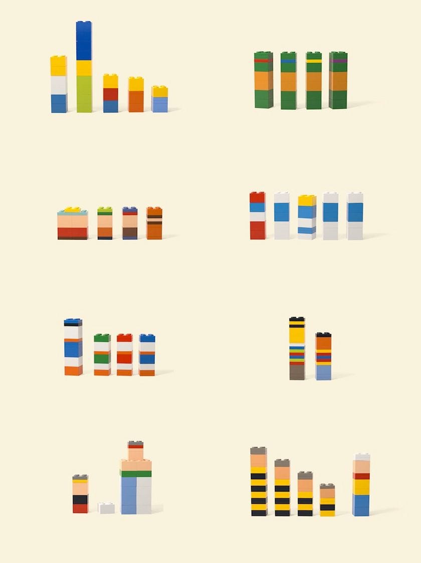
Mind is a fantastic thing. It needs constant input to work. Absence of any sensation; audio, visual, touch, taste, and smell can produce insanity. Also, an overload of the same can produce the same result. This issue of the newsletter will try to sum up the most common reasons and applications of visual information that can be interpreted wrong and cause some interesting and fun errors in our mental processes. They are commonly known as optical illusions. Many exist and can range from producing physical effects like the sensation of your own body moving (trains and windows) to nothing less than a simple shadow play (negative space). Our minds are rugged and, adaptive. Some are more or less logical and analytical but most of all our minds are imaginative. All minds have the same ability of imagination as it is vital in filling out missing information in our environment. How individuals use this ability and their awareness of it is what seems to vary from person to person. This absence of adequate information is omnipresent and our mind constantly fills holes in our perception, sometimes with purely fictional information if real-life experience or knowledge is missing. This allows us to form decisions with which we can be satisfied. If this does not happen we get into cognitive dissonance-like situations where we second guess the decision which can lead to real physical effects like nervousness, irritation, and others. Shapes in the image above are missing a lot of information and the mind is reconstructing the meaning with minimal information. It is a puzzle for the brain and like all puzzles, there is a small dopamine release when it finds a match. It also helps if the person doing the solving is in an amused state or the content of the puzzle is humorous. More psychological aspects and uses will be dealt with in some future issues. For anyone that did not recognize the figures on the left, they are Simpsons, Smurfs, Teenage mutant ninja turtles, and others. The lack of detail and information is almost complete but still, we could reconstruct the original information from our past visual cues. Also, their recognition is a testimony to their success in advertising.
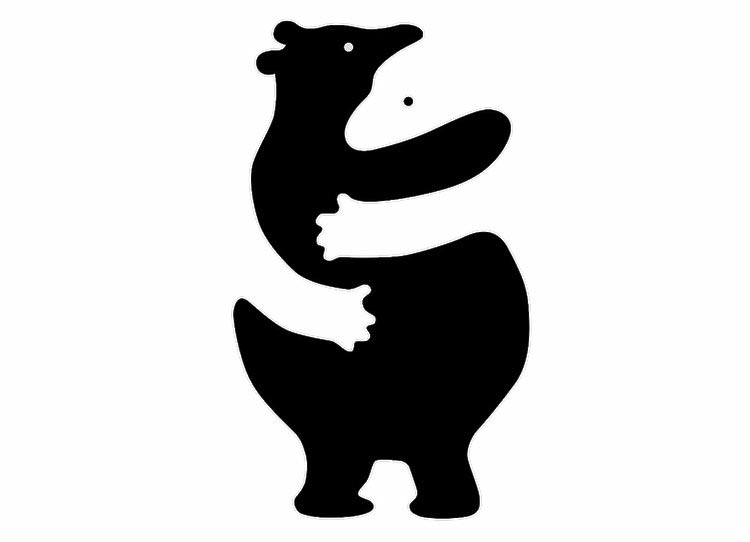
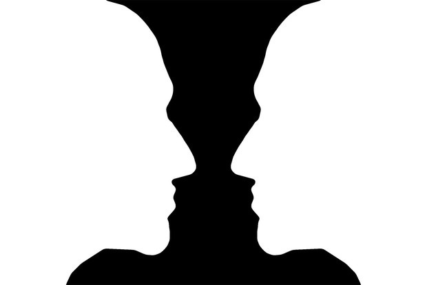
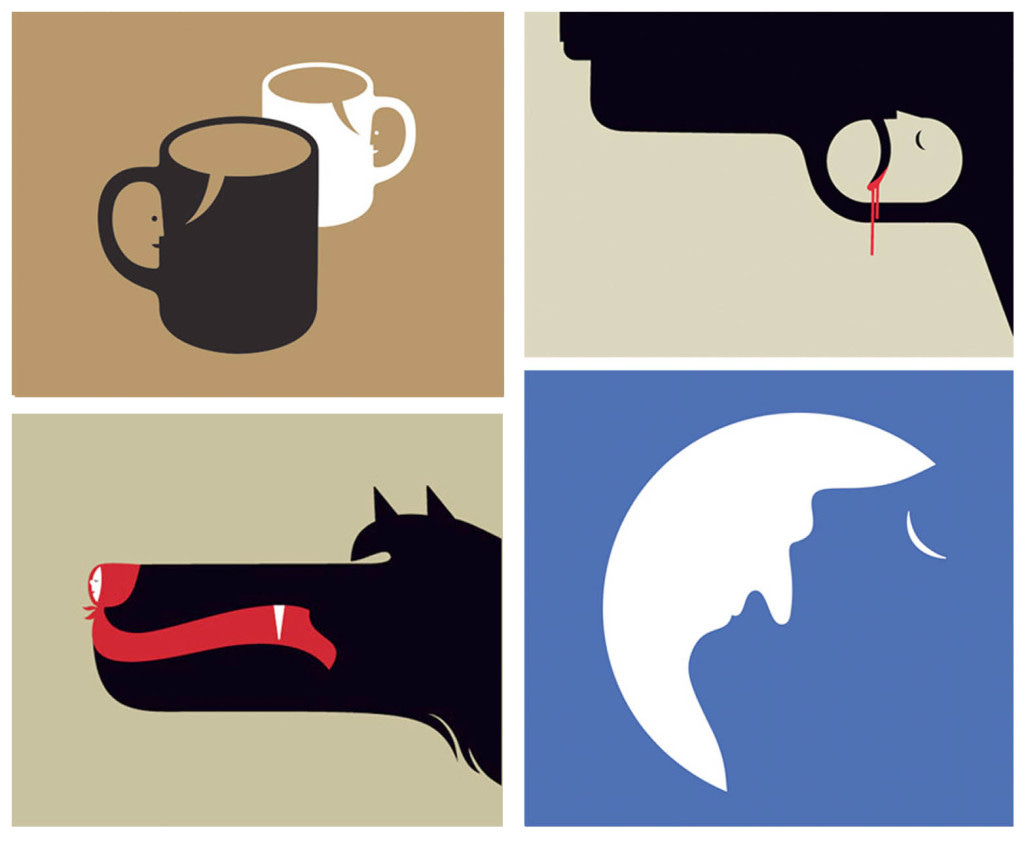
Negative space
Negative space is used often in the design of logotypes and can be extremely effective if used on noncluttered visuals. The most iconic example of negative space is the famous vase whose outline gives shape to two faces or two faces whose outline makes up the shape of a vase.
Negative space is usually used in ways that surrounding space around the main visual forms another image. This is not its exclusive use. One of the most famous examples of its alternative uses is the “Think Small” VW print ad.
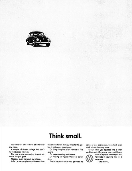
It uses negative space and positioning to indicate advancing movement, or that the small VW beetle will move toward the viewer. If the composition was different, like if the beetle was moved to the right it wouldn't have worked. Negative space is not an optical illusion in the most commonly understood sense of that word but is more subtle and thus rather successful especially if amusing or surprising.
Hollow, Reverspective, and Lenticular images
Hollow faces or their modification Reverspective as coined by Patrick Hughes is one of the most effective and usable effects in advertising that has a foundation in optical illusions. The effect comes from a reversed perspective painted on physically protruding extensions of that perspective. This enables images painted in that perspective to continue to change along those lines as the viewer moves. The physically protruding extensions can be introverted or can be raised from the surface. Depending on the type of illustrations on them they can move with your direction of movement or in the opposite direction. The effect can be best illustrated by the following video.
This effect is closely linked to lenticular print which rather than moving the perspective uses the same protruding shapes to change the image based on point of view.
A modern way to achieve this is to use thin flat lenticular shaped lenses from which the technique got its modern name. This is what most of us have seen and how the effect is mostly used. From business cards to pencil boxes and movie posters. They can store 2 and in some cases over 1000 individual images making the more dense visuals look like 7 sec movies than static images.
If lenses are moved independently from the underlying image it can produce an interesting effect that could be of particular interest to retailers.
The origin of all similar illusions can be found in the illusion of a “hollow face”. There is no way to break this illusion as it is ingrained in our minds. The effect is most visible with faces because we are wired to do so. Also, any object that we have day-to-day interactions with can provide the same illusion if done in negative depth. One way to increase the success of the illusion is by personification of an object. Add face features like eyes to an object and we instantly have a reference our mind can recognize thus reverting to our natural bias towards faces. It is not an illusion but helps to illustrate our tendency to see faces where none exist and can help to produce a desired illusion with objects.
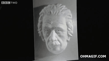
What makes this illusion more interesting than “normal” depth or raised version of the same face is its odd movement that seems to contradict our own expectations of how viewed objects should behave, how shadows should behave.
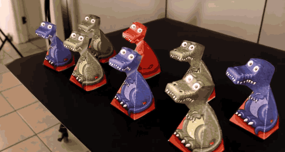
An example that combines perspective, lenticular, and our predisposition for faces is best illustrated by the paper dragon model which follows our movement with his gaze.
You can download and print out this illusion from PrintablePaperCraft.
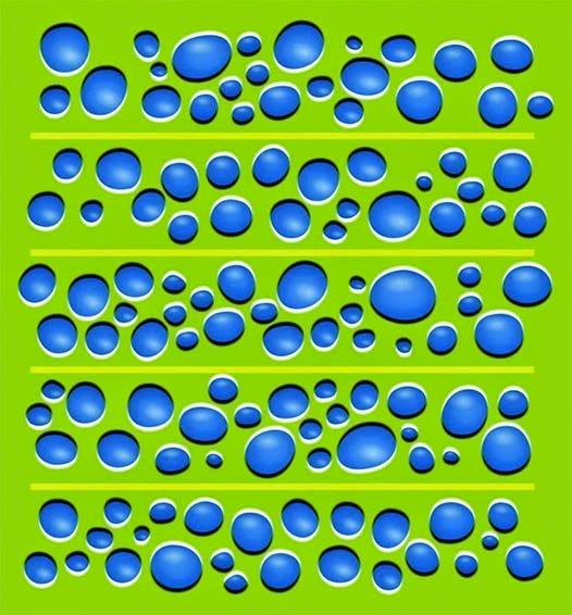
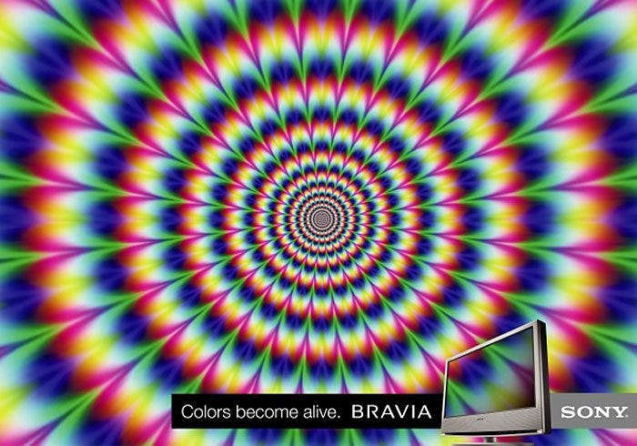
The Peripheral drift illusion
At the end, we come to the illusion that works best when no one is even watching directly at it. Peripheral drift illusion was a mystery for a long time and to some extent still is. This refers to why a small portion of people actually can’t see it and reasons for it. But, the general principle of how to produce it is well understood. This effect uses one property of color to produce the effect of movement, luminosity. To achieve the effect at least 4 colors need to be used. One that will be more or less constant across the entire image. Two colors on different extremes of luminance scale, like black and white, and one in the middle.

The middle color should have a different luminosity than the “background” one. By creating a step arrangement of colors of different luminance and how the direction of those steps is set up on individual elements of design effect of movement is achieved. If overused the effect is somewhat nauseating, and disorienting. The feeling of being out of balance can occur as visual cues and our internal balance senses are out of sync.
But if done right it can have a huge difference in attracting consumers to gaze at printed visuals that would otherwise be unnoticed. Because of those negative effects and over exaggerations the illusion has seen limited use.
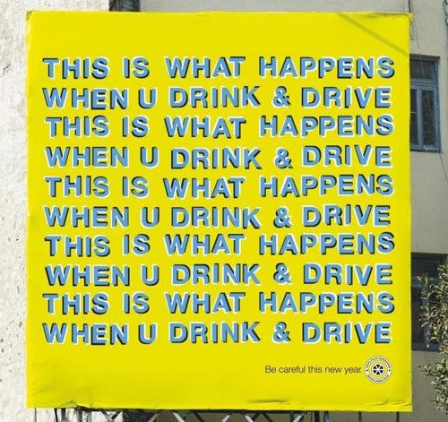
Case in point, ad for Sony Bravia, just imagine it as a billboard. That ad is an extreme example of how not to do it.